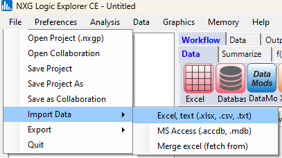
Select Import Data, then Excel:
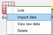
When using workflow icons, right-click on the Excel icon, and then select Import data
The popup window shown to the left will appear:
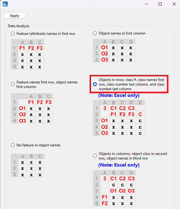
Select the radiobutton for opening an Excel file that contains a class feature, which also has the number of classes and class names in the first row of the spreadheet:
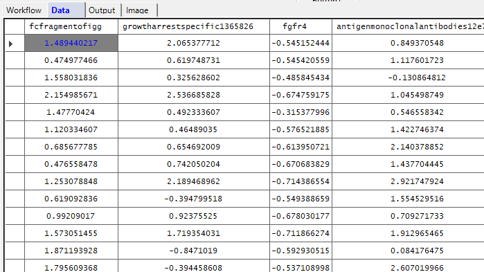
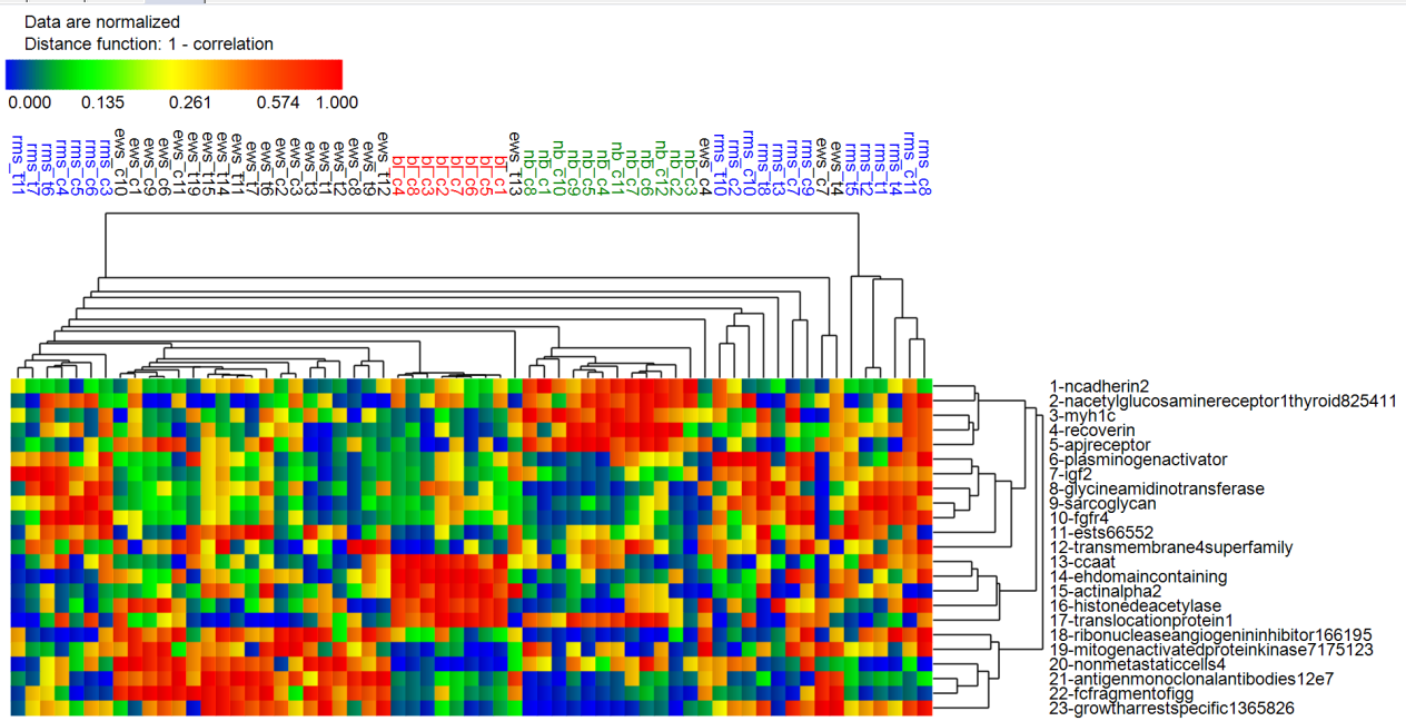
This tutorial uses expression values for p=23 mRNAs which are strongly predictive of n=63 SRBCTs in 4 diagnostic classes (Ewing's sarcoma, neuroblastoma, Burkitt's lymphoma, and rhabdomyosarcoma).
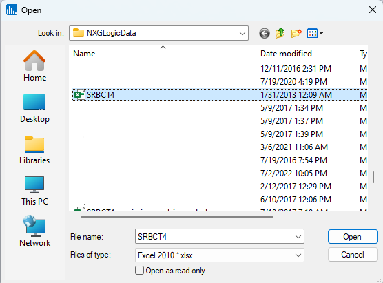
In the file-open dialog window, locate the SRBCT4.xlsx file that is distributed with Explorer CE and double-click on it:
You will then see that the data are loaded in the datagrid:
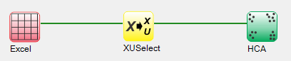
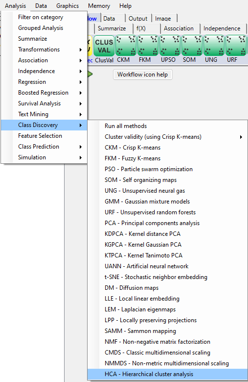
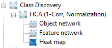
Next, in the Analysis pull-down menu, select Class Discovery, then HCA - Hierarchical cluster analysis:
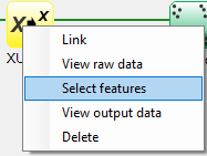
When using workflow icons, to select features, right-click on the yellow XUSelect icon, and select Select features:
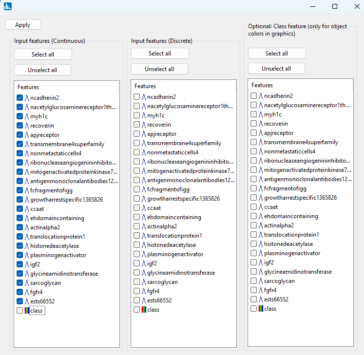
A popup window for feature selection will then appear (left, below):
In the next popup window, select all of the features except the class feature:
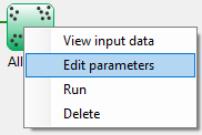
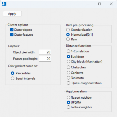
When using workflow icons, to select parameters for the HCA run, right-click on the green-colored run icon for HCA:
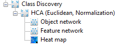
After you click on Apply (above popup window), the run will start, and the following output icons will appear:
When using the workflow (icons) for a pipeline, you can run all the tasks in the current workflow by clicking on the green-colored button shown below:
Otherwise, to run a single task in the workflow, then right-click on the specific green run-icon, and select Run:
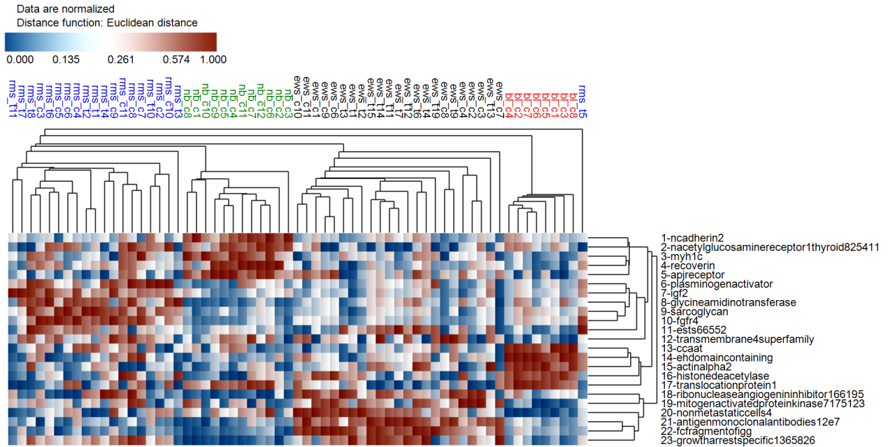
Click on the Heat map icon:
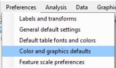
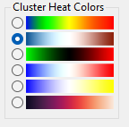
Let's change heat map colors, as well as the distance metric to Euclidean distance. Thus, in the Preferences pull-down menu, select Color and graphics defaults:
Select the navy-white-maroon color option:
We first need to specify the default heat map colors that are going to be used. Thus, in the Preferences pull-down menu, select Color and graphics defaults:
Then click on the Apply button:
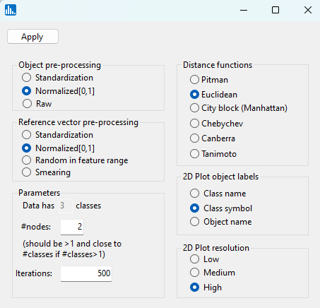
Rerun the analysis, and when the parameter popup window appears, select Euclidean as the distance metric:
In the parameter popup window, select Quasi-diagonalization, and then click on Apply:
After the run has completed, the following icons will be visible:
Click on the Heat map icon:
You will note that in the heat map based on Euclidean distance that the object clustering is better in terms of objects from the same input class ending up in a similar cluster. Recall, Euclidean distance will preferentially agglomerate objects whose feature value magnitudes are similar, whereas 1-correlation will agglomerate objects whose feature values correlate together.