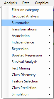
By pull-down menu:
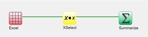
For this example run, we are using the Retinol.xlsx dataset, which is distributed with Explorer CE. To summarize data via the pull-down menu, simply select Analysis then Summarize, as shown below:
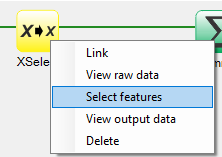
To select features to summarize, right-click on the yellow XSelect icon, and click on Select features:
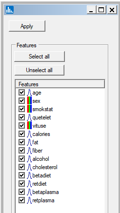
A popup window for feature selection will then appear (left, below):
A popup window for feature selection will then appear (below):
When using the workflow (icons) for a pipeline, you can run all the tasks in the current workflow by clicking on the green-colored button shown below:
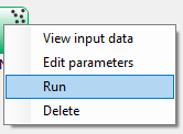
Otherwise, to run a single task in the workflow, then right-click on the specific green run-icon, and select Run:
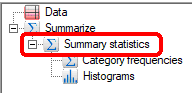
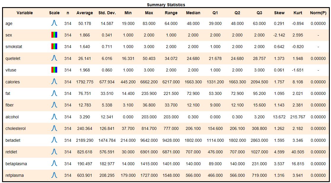
Once you have clicked on the features to summarize, click on the Apply button, and the procedure will run and output the icons listed below. Click on the Summary Statistics output icon:
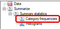
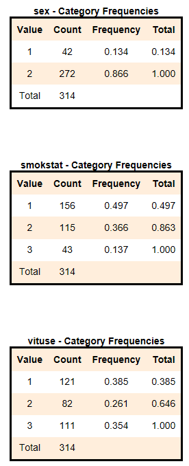
To see the frequency tables for categorical features, click on the Category frequencies output icon:
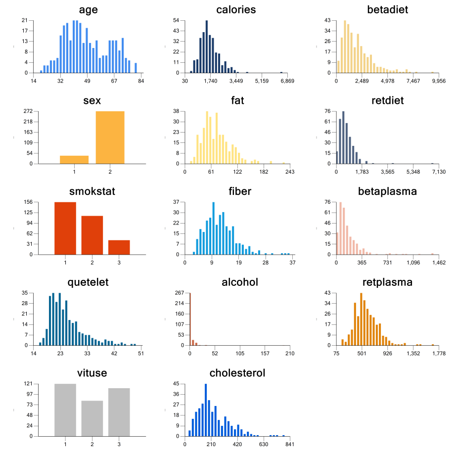
The graphical panel of histograms for all features, which was automatically generated, can be viewed by clicking on the Histograms output icon: